App
The home screen
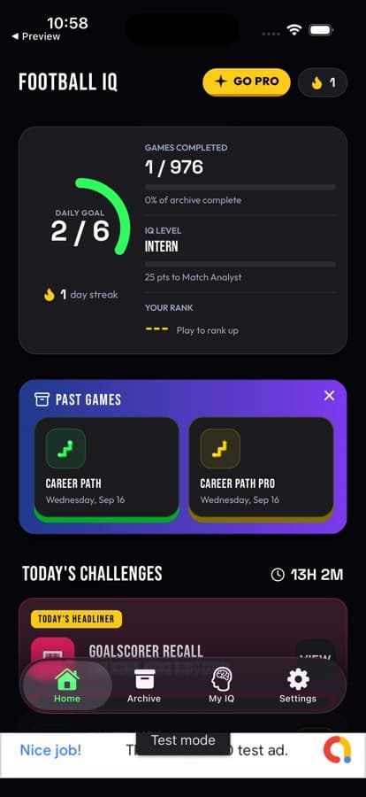
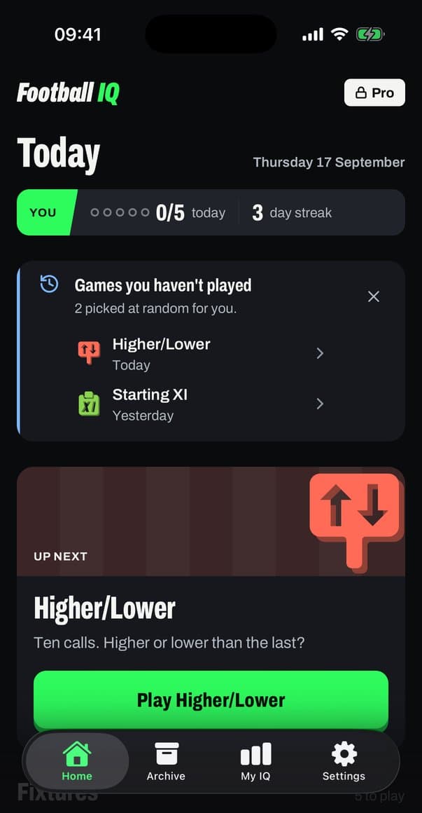
A dial, a progress bar and a purple banner became one Scorebug, one game to play next, and a list of the rest.
Redesign · September 2026
Football IQ has been redrawn end to end, in the app and on this site. It now reads like the score graphic on a match broadcast: a dark ground, condensed type, numbers you can take in at a glance, and one green kept for the things that matter.
Every game · iOS and the web · one design system
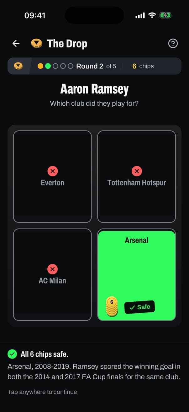
The old look was neon green on black with a glow on everything, and it could have been any mobile game. Football already has a visual language of its own — the strip along the bottom of a live broadcast, condensed numerals on a scoreboard, flat blocks of colour on a team sheet — and none of it needs a glow.
So the system, which we call Matchday, holds itself to three things: one accent green, one typeface at three widths, and one graphic device that turns up everywhere.
A strip whose lead segment is cut at ten degrees, the same angle as the italic in the wordmark. It carries the live numbers on the home screen, inside a game, on a result and on the leaderboard, so wherever you are, the numbers sit in the same place in the same shape. These are the real component, not pictures of it.
On the home screen
In a game
On a result
Archivo: wide for reading, condensed for titles, extra-condensed black italic for the numbers you earned. Sizes are named roles rather than one-off values, and the app and the site work from the same list. Every sample is real interface copy.
Green means go, right and you, and it is capped at about a tenth of any screen outside a game board. Gold is only ever something you earned, which is why nothing you can buy is gold.
Everything else is neutral — four greys, one off-white and the near-black ground. Because nothing decorative is coloured, a colour on screen always means something.
Every game has its own sticker, drawn as artwork rather than picked out of an icon set. The site uses the same drawings as the app, from one source, so they cannot drift apart. Most of them play in your browser; a few are app-only, and those are marked.
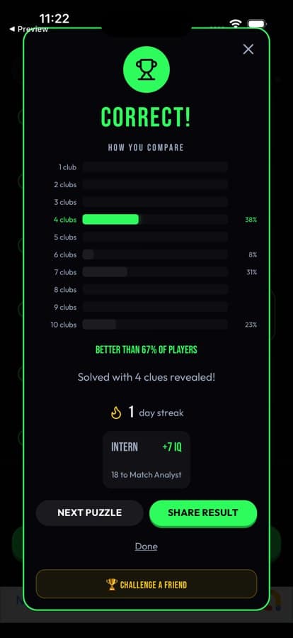
Real screen captures, not mock-ups: the old design on the left, the same screen today on the right. Nothing has been restaged or redrawn — the only edit is a trim at the bottom edge, where a test advert sat.
App
A dial, a progress bar and a purple banner became one Scorebug, one game to play next, and a list of the rest.
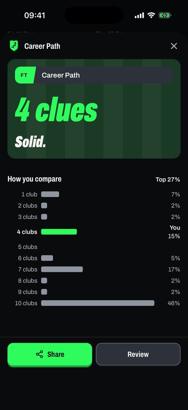
App
A trophy badge and a shout in capitals became the score itself, at the size it deserves, with how you compared underneath.
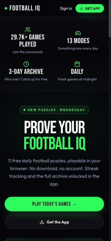
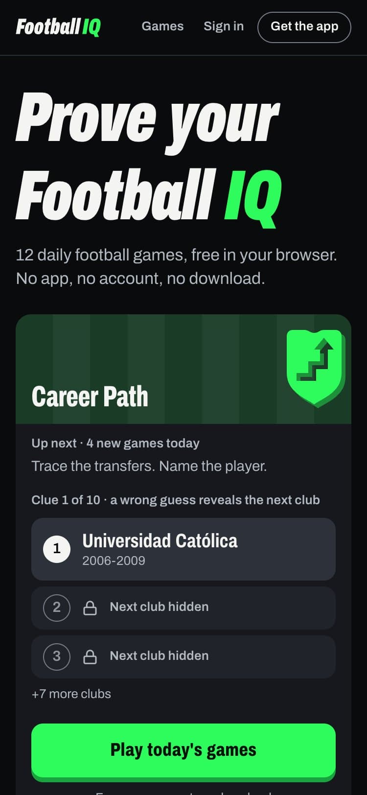
Website
A grid of statistics above the fold became today's actual game, playable from the first screen.
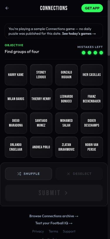
Website
Names set in small capitals became sentence case at a readable size, on tiles that press down onto a solid edge.
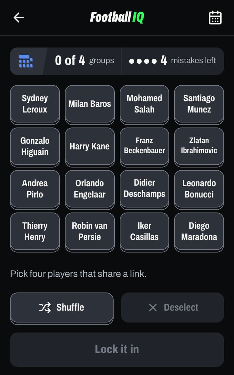
A look is only worth changing if the games get easier to play. These are the rules the new design holds itself to, on both platforms.
Nothing meaningful is set below 13pt, and every size under 24pt still works when you turn text up to 200%. Titles wrap onto a second line rather than trailing off, and a player's name is never cut short.
Every control is at least 44 by 44 points, with clear space around it. Buttons and answer tiles sit on a solid edge and drop onto it when pressed, so a tap has somewhere to land.
Turn text size up and the Scorebug goes to two rows, wide boards fall to two columns, and the buttons at the bottom stack full width. Nothing overlaps, and nothing quietly disappears.
Green is rationed. There is one green button in view at a time and it is the thing to do next, which is also why a paywall never gets to be the brightest thing on the page.
No confetti, no glow, no animation looping in the corner while you think. The one celebration is a wipe across the Scorebug, and it holds still if your device asks for reduced motion.
Right, close and wrong each carry a glyph as well as a colour, and the result is written out for screen readers. The board still reads if green and red look the same to you.
The new design is on both, but your IQ, your streak, the full archive and the games you cannot play in a browser are all in the app.